filters components

Refactoring Filters

Improving the usability and usefulness of table filter components

Design Systems
|
UI Components
|
6 min read
Background
Since Rubrik’s products are data-intensive, filters play an integral role in helping users navigate data in tables more efficiently to find what they’re looking for quicker and with ease. 
What started as a small task to fix a bug turned into my first major components project to revamp filters. Over a couple of months, I worked with engineers on the core components team to rethink the broader list page experience, in order to make filters more accessible and easier to use.
Role
Product Designer, Visual Design Team at Rubrik
Stakeholders
Design Manager, UI Engineers, Engineering Manager
Timeline
October – December 2021
filters definitions
Anatomy of our filters
  1. Filter group – A single filter category with filter options as checkboxes or radio buttons
  2. Filter group name – The name of the filter category in the filter group
  3. Selected filters count – Number of filters that have been applied by the user
  4. Filter option – A selectable checkbox or radio button in a filter group
  5. “Show more” link – Link that reveals the remaining hidden filter options on click
Other terms
  • List page – A standard page layout with a table, table actions above the table, and filters on the left side
  • Filters – Refers to all filters on a list page
01
01

Problems

Filters, as a component, was in its teenage years when I started working on this project. Although it had gone through some developments from its original form, it still had yet to evolve into the mature form where it could be plugged into designs and serve all the unique cases asked of it.

1. Current design not future-proof 

current designs not future proof
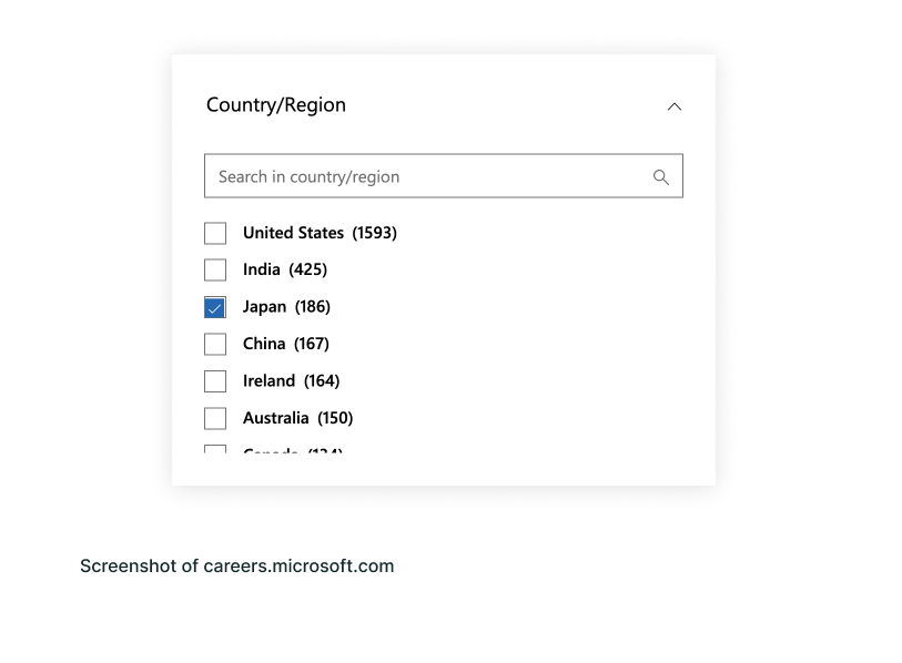
The visual design and interaction of filters wasn’t scalable to accommodate large amounts of filters. One example of this was the "Clusters" filter. By default, only three filters were shown for each filter group, and there was a link to reveal the remainder. For the majority of our users, the number of clusters they have is under 10, however, a couple of our large organization accounts have over 1000. For them, when they clicked on the overflow link, the filters list would scroll endlessly.

2. Inconsistent component usage

filters inconsistent usage
In addition to the nascent design of the filters, the lack of usage guidance resulted in inconsistent applications of filter behaviors across the product. Although there was a search field that could be shown in the filter group, there was no logic set for when a filter group should have one. Since it was up to the designer's or developer's discretion, there would sometimes be 3 filter options with a search field, or there would be only a search field without any options surfaced by default.
problem statement
How can we redesign the filters interaction so that users can search for specific filters with ease and have a more consistent experience across list pages?
02
02

Research

Since this was one of the first component projects I owned, I leaned on the experience of the designers that have been on the team longer and were more familiar with the history of the component than I was. After sharing the initial problem with the broader product design team, I was directed to look into these consumer products as references:
  • Kayak
  • Wayfair
  • Microsoft

Kayak

kayak chips
I was told that one of the main references of the current design was Kayak. I recognized the visual inspiration for the caret, divider, and the “Show more” link to reveal overflow filter options that we had in our filters. But in their particular example, the number of options under the Airlines filter would not exceed the dozen or so fixed options they offered at any given time. Therefore, this filter interaction is optimized for a case where the number of options is known and is no more than a couple dozen.

Wayfair

wayfair chips
A fellow designer on the team suggested I look at Wayfair’s filters, since they had quite a lot of filters for their customers to narrow down their vast catalog of furniture products. What I liked about their filters interaction was that each filter group had a maximum height, and filter groups with a lot of options had an independent scroll within the group. This design seemed more scalable as a long list of filter options wouldn’t affect the other filter groups below.

Microsoft's careers page

microsoft chips
To figure out how search should work within filters, I referenced Microsoft’s careers page. Their filter groups were similar to Wayfair, with a maximum height and individual scroll within, and the filter group for "Country/Region" also had a search field. The most relevant takeaway for me from their filters experience was how it was possible for selected filter options to be out of view when I did a search, selected a filter, then cleared my search.
03
03

Initial Proposal

From my findings from referencing other filter experiences, I created the following initial proposal:
initial filters proposal
  • The “Show more” link is replaced with a scroll inside filter groups with 8 or more filters options, to improve the scalability of the component.
  • A search field will always be accompanied with filter options, so that filter interactions are consistent across different pages.
  • The selected filters count will be stylized in a badge rather than text in the filter group heading, in order to make the number visually distinct from the filter name.
04
04

Feedback

Engineer feedback

I shared my proposal with the UI engineers that implemented the current version of filters. Although they liked the addition of guardrails by setting a maximum height of the filter group, they noted that the proposal to implement an independent scroll for each filter group would create an unwanted double scrolling behavior.
filters engineer feedback
This was because the entire filters sidebar was currently already a scroll area, so having multiple scroll areas within a scroll area would create a bad user experience.

Designer feedback

After getting feedback from the engineers on feasibility, I presented my proposal to designers on the team for design feedback. Overall, they were in favor with removing the link for "Show more" to adopt an individual scrolling instead. The notes I did receive were on further interaction enhancements:

The search field opening a dropdown menu seems a bit redundant since it’s showing the same options that’s already in the filter group. Is it possible to have the search filter the options within the group directly?

Daniel Nguyen

Product Designer, Rubrik
search field redundant

When there are filters selected, the Clear link in the filter group heading takes up a lot of space, and makes the filter group name even shorter. Could we increase the space for the filter name so that there is less truncation happening?

Pengfei Wang

Senior Product Designer, Rubrik
filter name truncated
05
05

Final Proposal

Undoing double scroll

Undoing double scroll
To avoid having double scroll, which is a less-than-ideal user experience, we increased the scope of the project to factor in the overall list page scroll experience. Instead of having a separate scroll for the filters sidebar and the table, there would be one single scroll interaction for the page as a whole. Since we had implemented pagination controls for the table, there wouldn’t be a case of infinite scroll.

Turning the search into a true search

True search experience
Since I had already set a maximum height for each filter group, it was then possible to have the search field directly filter the options within the filter group’s scroll area. This update made the search interaction more consistent with other search experiences in our product.

Tucking the Clear link behind hover

Clear link hidden
To address the feedback about filter names being truncated due to lack of space, I worked with the Senior Visual Designer on my team to come up with a dynamic hover interaction on the selected filters count badge. The Clear link will not be shown when the user is interacting in the table or outside of the filters. When the user hovers over the filter group, the number badge expands into a pill with the Clear link inside.
Below is a sample of the redesigned filter components and interactions in Rubrik's dark and bright theme:
filters dark finalfilters bright final
06
06

Retrospective

It’s been almost a year since this first phase of refactoring filters to become scalable with our product’s growing requirements. The most challenging part of this project was balancing the different UX design priorities of consumer products and those of data-intensive SaaS products. Our product design team values providing consumer-grade design to our customers that is minimalistic yet delightful, while delivering the usability of a robust enterprise product. So, proposing changes that affect our core data display layouts comes with much scrutiny and needed validation from many stakeholders.
Since this was one of my early projects on the team, I had less familiarity with the design patterns than I do now. The next phase of development for the filters component will be on optimizing the user journey interacting with data in tables. This includes UX research into just how users use filters in conjunction with the table search field together, how many average filters are selected on a list page, and if it’s necessary to display a row of selected filters on every list page.